Creativity in printed advertising - Part 2: The illustration revolution
Part 1 of this article on creativity in printed advertising covered the early period from the 1890s to the mid-1920s when photogravure and colour brought remarkable advances in the ability of such advertising to engage and attract readers.
Here in Part 2 we cover the advent of even bolder imagery up to the early 1930s – and for this we start as early as 1907. Why? Because the motor car, even from this early period, was so exciting and so costly that manufacturers could justify the most eye-catching and creative advertisements.
Pushing the limits
Our first example dates from 1907 and shows how powerful an advertisement could be, even in those early days of the motor car, if the product was expensive and the advertising could be placed in a publication read by the highest echelons of society. This advertisement comes from the November 1907 issue of Country Life in America. It has no need for any effusive copy: this most patrician American manufacturer, Pierce-Arrow (at that time still known as the George N. Pierce Company), simply shows the cream of American society entering their chauffeur-driven ‘Great Arrow’ after a visit to the theatre. This company was one of the ‘Three P’s’ – Pierce-Arrow, Peerless and Packard – that stood head and shoulders above other pretenders to luxury status such as Cadillac.
Even Pierce-Arrow could not compete in exclusivity with a yet rarer and more expensive automobile – the Lozier. In this advertisement from a 1912 issue of Collier’s magazine, there is clever allusion to the type of American gentleman who owns a Lozier: a captain of industry who uses his car for business. This idea was to return as late as the early 1950s when a very similar advertisement by Bentley contained the same imagery: the businessman, the construction site with the crane, the drawing and the chief engineer.
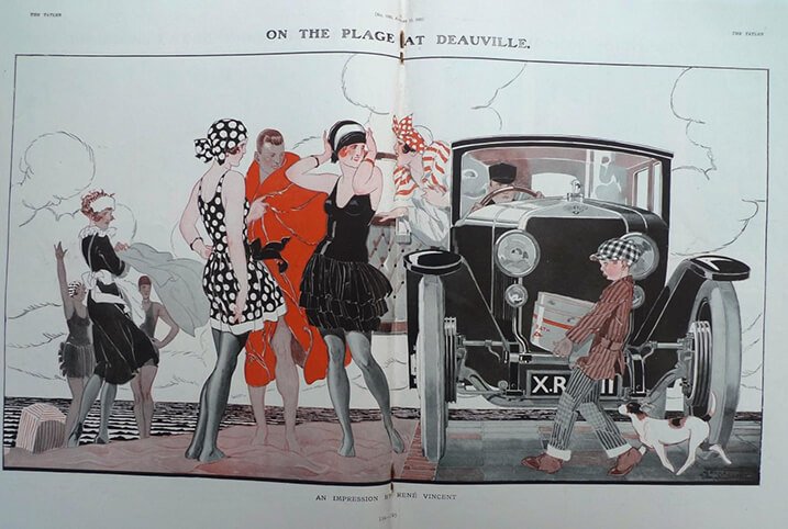
There is another point to be made from the two American examples shown above: the far greater quality and boldness of printed advertising in the USA in comparison with the rest of the world, right up to the 1950s and perhaps beyond. America had the population and the prosperity that justified this; the finest advertisements are often to be found there. Nevertheless, Britain could compete in its most august publications. Our next example is not strictly an advertisement but is an illustration from a 1921 issue of The Tatler. It shows the bright young things from the Roaring Twenties enjoying life ‘On the Plage at Deauville’ – the place to be seen. There is, however, some very clever product placement going on: the car is a Hispano-Suiza, a French car that was arguably more upmarket than a Rolls-Royce in the early 1920s.
Moving away from the narrow field of the motor car, the next advertisement shows how Bovril gained in confidence and creativity from the 1923 example shown in Part 1 to this striking advertisement from a 1925 issue of the Illustrated London News (ILN). The happy gentlemen (a shipwrecked sailor?) is fortified by Bovril, although where he managed to get the hot water is not explained. The strapline’s humorous double meaning is as creative as the illustration.
Competition also drives creativity. This Oxo advertisement in a 1925 issue of the ILN uses a very similar strapline to Bovril’s, but here tugs at the emotions of the family audience with the time-honoured device of the mother and child in the kitchen.
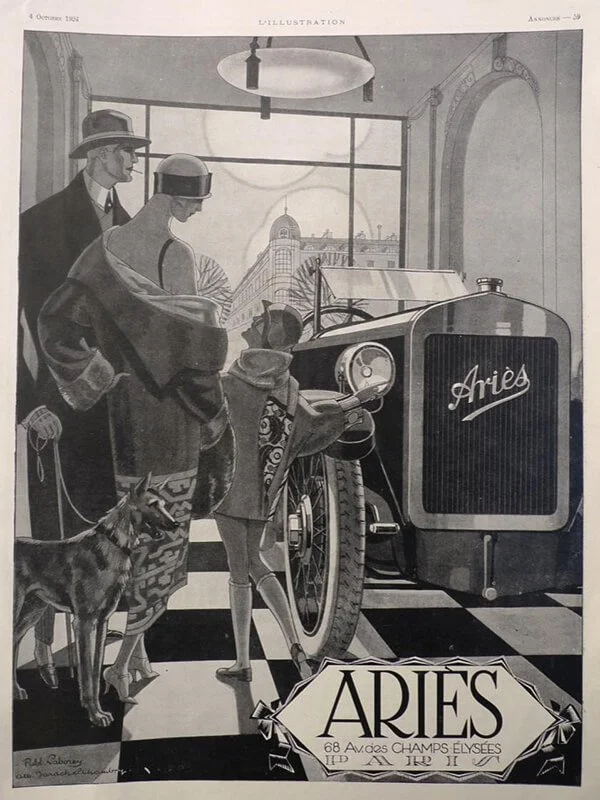
Returning briefly to the motor car. The top manufacturers could appeal to the wealthiest customers in high-quality magazines, but some lesser makes were bold enough to attempt to claim that they were of equal merit. The French equivalent of the ILN, L’Illustration, contained many of these efforts to attract custom by convincing the middle classes that they could climb the social ladder for a lot less money. This example from 1924 shows a distinctly stylish family looking at a very mid-market Ariès car. The showroom is, however, in the Champs-Élysées – so the illusion of exclusivity is maintained.
Creative advertising is delightfully on display in this 1925 example from a 1925 ILN issue. The transparency of Pears soap is wittily used: the bar of soap becomes a magical crystal ball in the hands of a fortune-teller. The advertisement is clearly aimed at the well-dressed, fashionable woman-about-town. Here, too, is an excellent piece of social history: advertisements give tremendous insight into clothing and social customs of any period.
Talking of social customs: this relatively unassuming advertisement from the ILN in 1925 is promoting the health-giving properties of Ovaltine – but it is appealing to the stylish customer who is, according to the text, escaping from the “gloom and dampness of an English winter” to “the bright sunshine of Switzerland.” And this is in the days when only the wealthiest could afford a Continental skiing holiday.
Part 1 showed a Hovis advertisement that stressed family values with a sentimental theme: grandma knowing what is best for her little granddaughter. Here in 1925 the theme goes from sentimental to downright cutesy, with an illustration by the famous artist Mabel Lucie Atwell. It still stresses family values, but tugs at the ‘Aaah…’ strings at the same time.
Middle-class readers could by 1930, the date of this ILN advertisement, afford a mid-range car. This clever advertisement from Morris does away with any text and simply provides an allegorical illustration that draws the reader in, making them think that a bit of light touring might be good fun if they had a Morris saloon. The smart car, the slightly confused country blacksmith, the English country village, ye olde pub and, once again, the latest fashions (no need to put on scruffy clothes) all build desire to buy the car.
Colour advertising in the 1930s was naturally confined mainly to the more upmarket publications. It is here that there was enough potential business to be had to justify investment in colour and in placement of promotion in magazines where the rates for inserting an advertisement were high. This final example for Part 2 comes from the 1932 edition of The Book of the Braemar Gathering. It is for Vapex, a treatment to clear airways of the symptoms of colds and the like; the product may be humdrum but the sales potential at the time would have been enormous, and thus worthy of colour – and a drop of creative imagery as well as a drop of magic.
Join us again for Part 3, where we shall look a little further into motor car advertisement in the 1930s, and at the way in which creativity in advertising had to grow up in the challenging years just before and after World War II.


