
Creativity in printed advertising - Part 3: Challenging Times
Part 2 of this article on creativity in printed advertising covered the advent of bold imagery up to the early 1930s – including the very important area of motor car advertising, where the value of the car justified the creation of dramatic and enticing advertisements, often in the most expensive publications. In Part 3 we shall look at more of these motor car advertisements in the ‘Golden Age’ of the 1930s, and at the way in which creativity in advertising had to grow up in the challenging years just before and after World War II.

The motor car comes of age
After the experimental early years of the motor car up to World War I, in the post-war period cars evolved into reliable forms of transport. Their increasing sophistication was matched by the advertisements used to sell them – both in the use of colour and the more subtle emphasis on lifestyle. Our first example is from a 1923 issue of the American Saturday Evening Post and is not only typical of that evolution but is generally recognised as having changed all print advertising – not just of motor cars but of all consumer products. Copies are on the walls of all the major Madison Avenue advertising agencies in New York to this day. Instead of vaunting the capabilities of the motor car in question, it focused entirely upon tugging at the sensibilities of the potential owner – essentially claiming that: “… you too can have a bit of this lifestyle if you buy our car.” The advertisement is so famous that any advertising executive will refer to it not as the Jordan Playboy advertisement but as “Somewhere West of Laramie.”
We have replicated the text here:
“Somewhere west of Laramie there’s a broncho-busting, steer-roping girl who knows what I’m talking about. She can tell what a sassy pony, that’s a cross between greased lightning and the place where it hits, can do with eleven hundred pounds of steel and action when he’s going high, wide and handsome. The truth is—the Playboy was built for her.”

For our next example we move from the most influential to possibly the most beautiful. A recent French book on the world’s finest advertisements used it as the cover illustration – which speaks volumes. It dates from a 1929 issue of the German publication Das Magazin. Mercedes-Benz and its logi were by that time famous enough to require no text to explain anything – but it used the combination of a sports car and a pretty woman in racing overalls to stress the qualities of the marque; a winner in races and on the road.
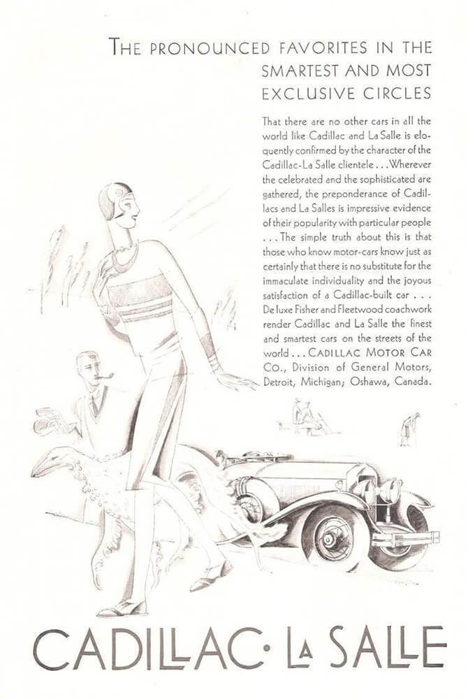
In our next example of upmarket motor car advertising Cadillac (and its junior marque La Salle) felt the need to use plenty of text to put over the message of exclusivity and social position. But it is even more remarkable for its use of certain very specific symbols of “good taste”. This is not just provided by the latest fashion being worn by the lady – but also by its use of a breed of dog that appears time after time in advertisements on both sides of the Atlantic. Elegant dogs can help to sell a luxury motor car, but only one breed sits at the top of the tree: the Borzoi.

Our final example of advertisements for the finest motor cars of the 1920s and 1930s returns to a marque featured in Part 2 of this series: Hispano-Suiza. It comes from a 1932 issue of the French weekly magazine L’Illustration and features an image by one of the most sought-after artists of the era: A. Kow, the Russian-born French designer, poster designer and illustrator whose birth name was Alexis Kojevnikov. He was renowned for his illustrations for the advertisements of many prestigious makes, principally Hispano-Suiza and Panhard et Levassor. Here, Know cleverly combines the lines of the car with the reference to its flying stork mascot, with allusion to speed and elegance. Very little text is used – or needed.

Advertising matures
Leaving behind motor car advertising, we now look at more general pre- and post-World War II advertising, and how the social conditions led to some significant changes forced upon it by the depression of 1929 and the war itself. Our first example shows little or no signs of any gathering clouds: it is simply an elegant advertisement from April 1930, seen in the Illustrated London News (ILN), for Austin Reed suits for spring. It combines alluring copy with a pure piece of Art Deco illustration. Only six months after the Wall Street Crash, it does well to hide any inkling of the economic woes that would steadily overtake the world over the next few years.

Only two years later, this piece of American advertising continued its bold confrontation – or perhaps even downright ignoring – of any economic worries by using an outrageously powerful advertisement for the lowly cigarette. It chooses an illustration of a violent and “raw” historical event – The Rape of the Sabine Women (carefully adjusted to “The Raid on…” to avoid frightening readers) – to contrast it with the mildness of Lucky Strike cigarettes. This is certainly an advertisement of its time, well before smoking ceased to be an acceptable subject for assertive promotion.

One thing often lacking from 1930s advertising was humour. It had been seen in the late 19th and early 20th century, but seemed to have been replaced by serious and worthy promotion. But things were changing, and a prime example comes from a different area of advertising – business to business – and the work of Desoutter. Our next advertisement shows just how stolid Desoutter’s promotion was in 1935. It is advertising its power drills with the obvious statements of performance and quality, but lacks any real excitement to lure the potential user.

Then came the change for which Desoutter became famous: the use of humour that would not only make an impact upon buyers but would make them look forward to the next example, almost like the wait for the next ‘Snoopy’ cartoon. This raising of awareness and delight made a massive effect upon the success of Desoutter before and after the war. Our first example is from November 1940, amazingly in the darkest times of the war, five months after Dunkirk and in the middle of the Battle of Britain. It is for a product as prosaic as a power tool to cut off the protruding shank of a bolt after assembly (much needed during war production). But the allusion to Alice in Wonderland makes it interesting, amusing and attractive in a dark and serious time.
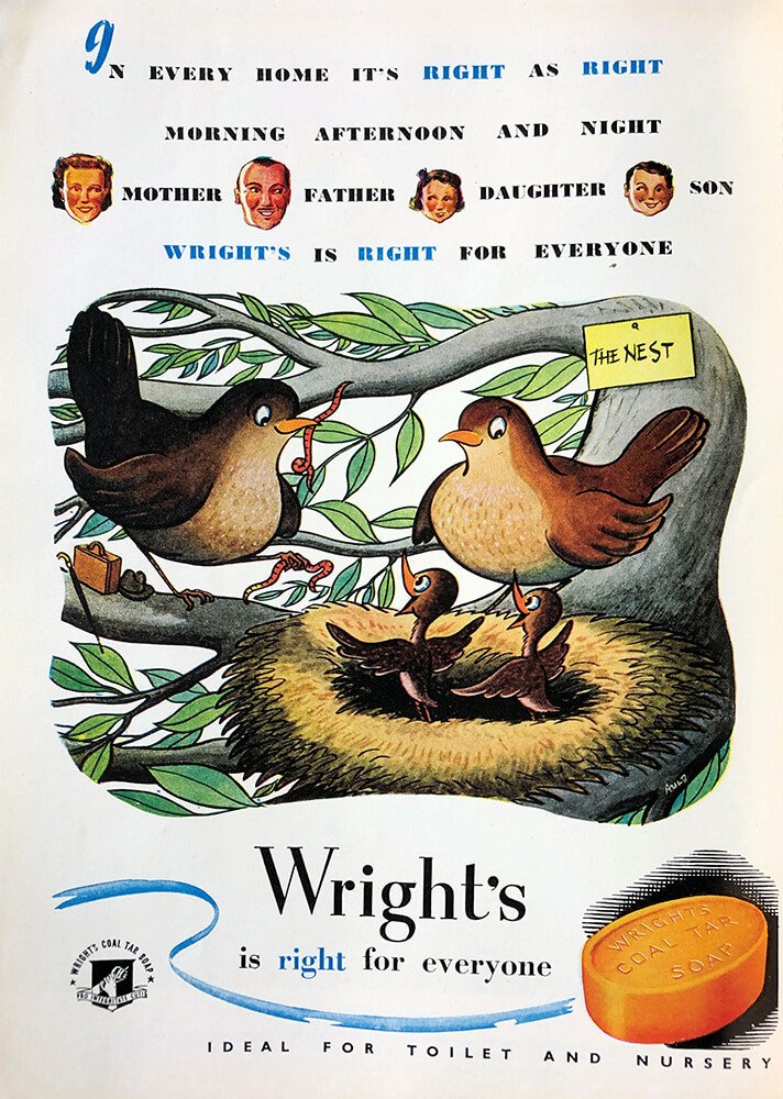
As the deprivations of wartime passed into the austerity of post-war Britain, advertisers needed to bring some colour and humour into the lives of potential customers. Our next example is typical of that early post-war style, often reliant on vibrant cartoon-like illustrations. It is a 1947 advertisement for Wright’s soap taken from The Book of the Braemar Gathering – the programme for the annual Scottish sporting event attended by Royalty and therefore the Great and the Good. Not only does it have an amusing rhyme, but it also uses a distinctly ‘chirpy’ cartoon to make the link between a bird’s nest and the ‘nest’ that is a family home. It may have been too early for the family to buy expensive products, but they could be convinced to buy high-quality soap.

As post-war austerity gave way to the optimism of the 1950s, advertising could attract customers to buy more expensive versions of essential but relatively costly items. A new child requires a pram – but the best prams were arguably those of Silver Cross. To drive home this message, the company always included a Rolls-Royce in the background. Its presence was never explained; it simply implied, subtly, that its product was the ‘Rolls-Royce’ of prams. To make this presumption work, the illustration had to be very stylish – and it was.

Photographs can work…
The maturing of advertising continued into the 1960s – but it was not a universally successful evolution. Many advertisers felt that they had to move with the times and allow photography to overtake illustration. This often resulted in a depressing lack of creativity (in particular the use of colour photos of plates of unappetising food). But creativity had not died. Our two final examples show that excellent colour photography and a quirky, humorous way of putting overt eh message can work very well. Both are from 1966 issues of the New Yorker magazine. The first is for a PBM Italian jacket. The fact that is for a man is not immediately obvious – until we get the joke: the jacket will impress the woman so much that she will try it on…

The second 1960s photographic advertisement uses the same trick. The image is of high quality, but it also makes a humorous and powerful point: the Personna razor blade wears out really slowly – as slowly as a tortoise. Advertising may have grown up and illustration may have faded – but creativity in advertising lives on.